Annex
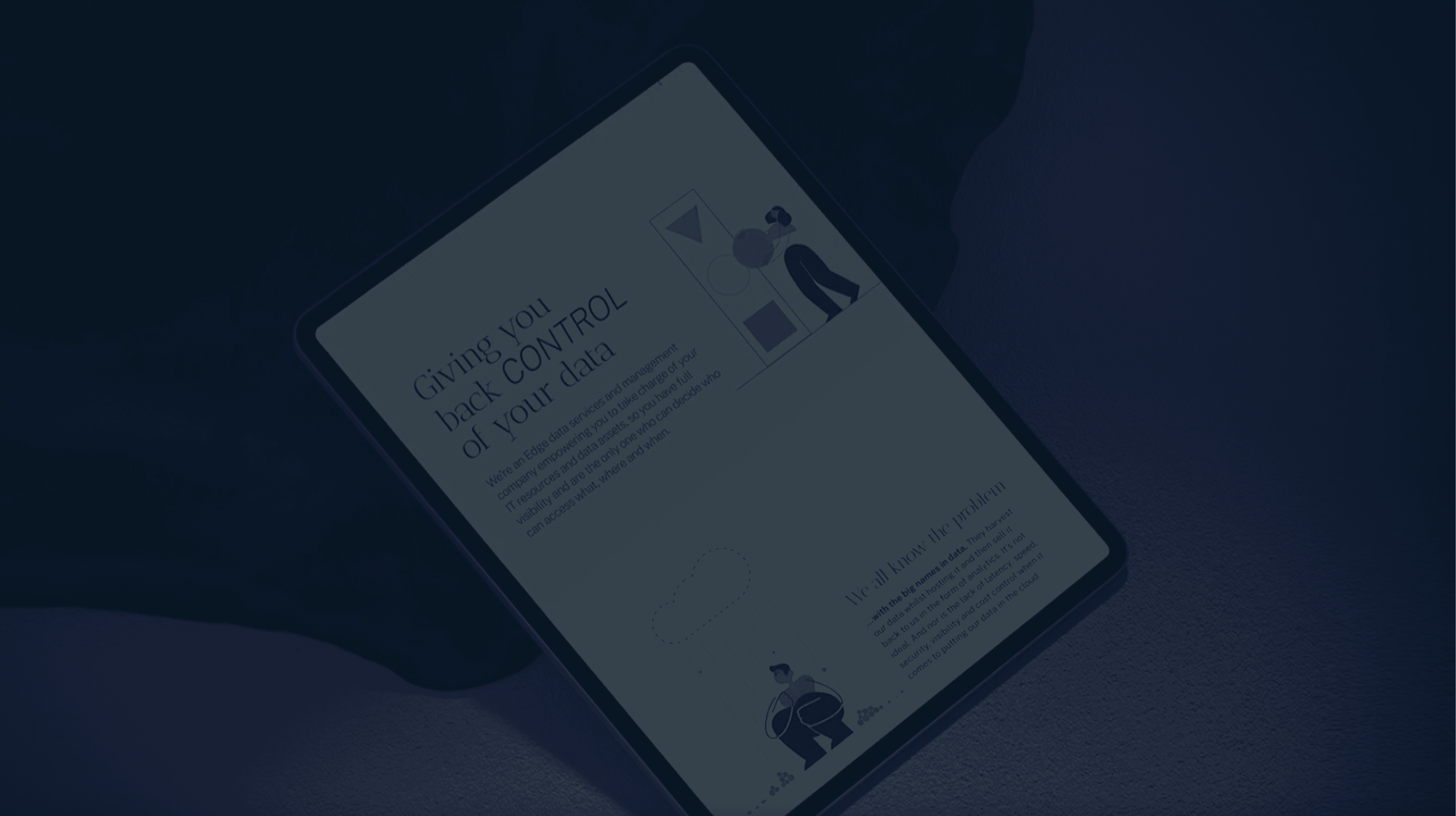
Giving you back control of your data
Data privacy gets a personal touch
It's always a treat when a client is ready to take a creative leap. Reticle was exactly that type of client. They came to us in search of a bold brand evolution—a new name, look and feel that would break them out of the corporate mould. The mission? To develop an identity that truly expressed their dynamic, human-centred approach to data privacy and decentralisation. This wasn’t about helping them to fit in. It was about making them stand out. Enter Annex.
The Challenge
When Reticle approached us, they were excited to shed their old identity and embrace a fresh, contemporary approach. Operating within a highly corporate, tech-driven industry, they stand out as a family-run, people-centred organisation that truly prioritises the client experience. We needed to deliver a brand transformation to embody their core values, while positioning them as an alternative to big-name competitors like AWS.
The Solution
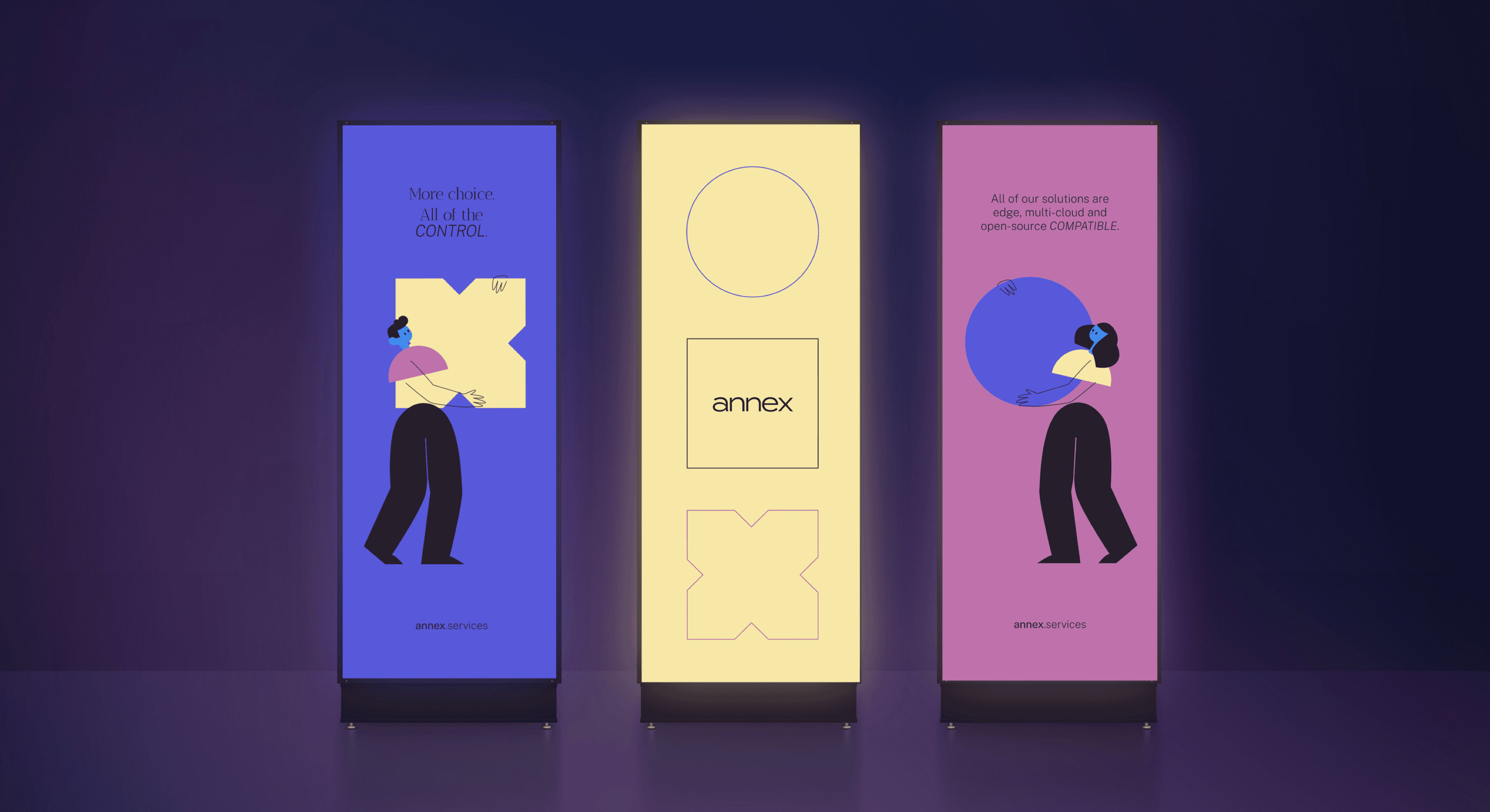
First, we needed a new name—one that was catchy, modern and reflected the company’s role of empowering clients with the building blocks of data management. And so, Reticle became Annex. Next, it was time to brighten things up with a cheerful colour palette, bringing warmth and energy to the brand. Our designers then incorporated illustration and animation to add movement and showcase how Annex puts data directly in the hands of clients. To top it off, we crafted a clear, approachable tone of voice to make sure 100% of Annex’s content was easily accessible and understandable.

The Results
Annex’s fresh, fully integrated identity had immediate results. They saw a spike in web traffic as clients engaged with the new user-friendly digital experience, while existing clients had an overwhelmingly positive response to the new name and visuals.
Ultimately, Annex was able to establish a stronger industry presence, setting itself apart as a trusted partner in data privacy solutions.