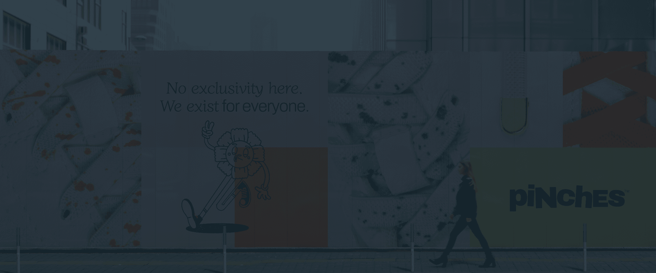
Pinches
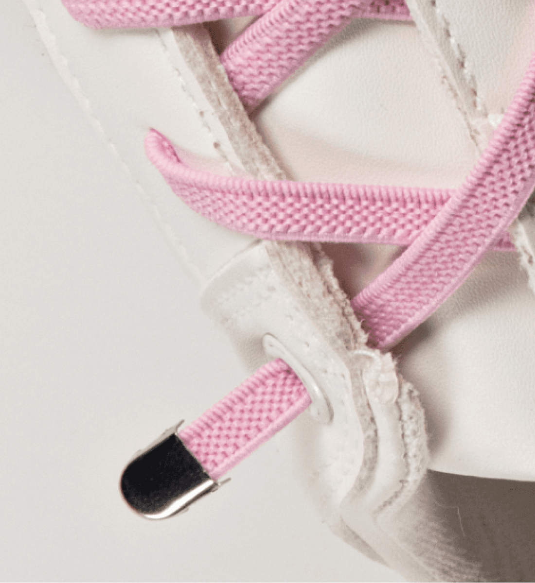
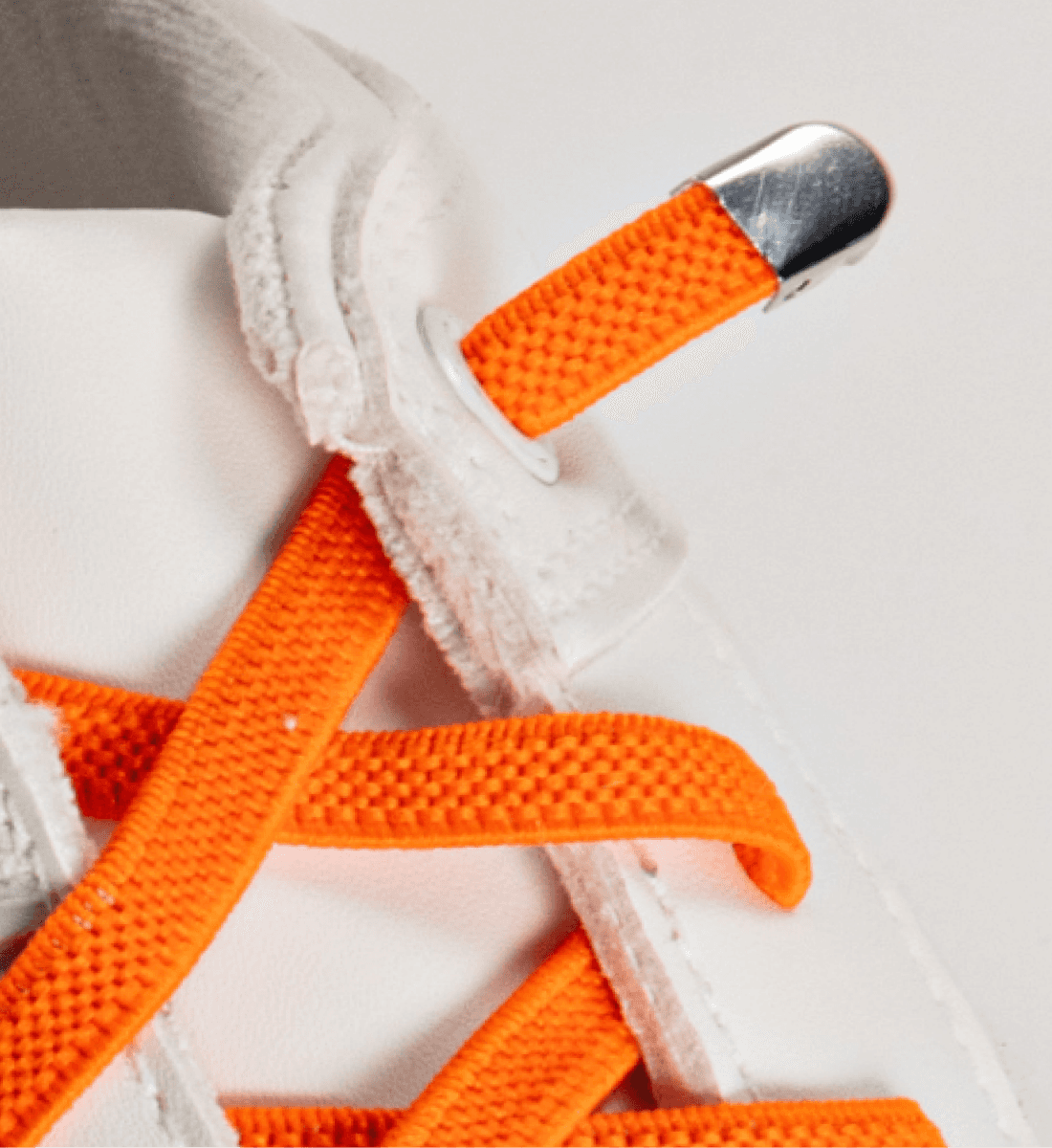
The no-tie elastic laces that come with a Pinch
Written by
Lucy Grogan
|
Updated
Step by step: Pinches gets a glow-up
Pinches is a brand on a mission. Their no-tie elastic shoelaces prove that innovation and inclusivity are the perfect power couple, making great style easily accessible. They turned to Studio East for a brand makeover that would capture their unique blend of purpose and play, while setting them up for success in the lifestyle space. We laced up for the challenge.
The challenge
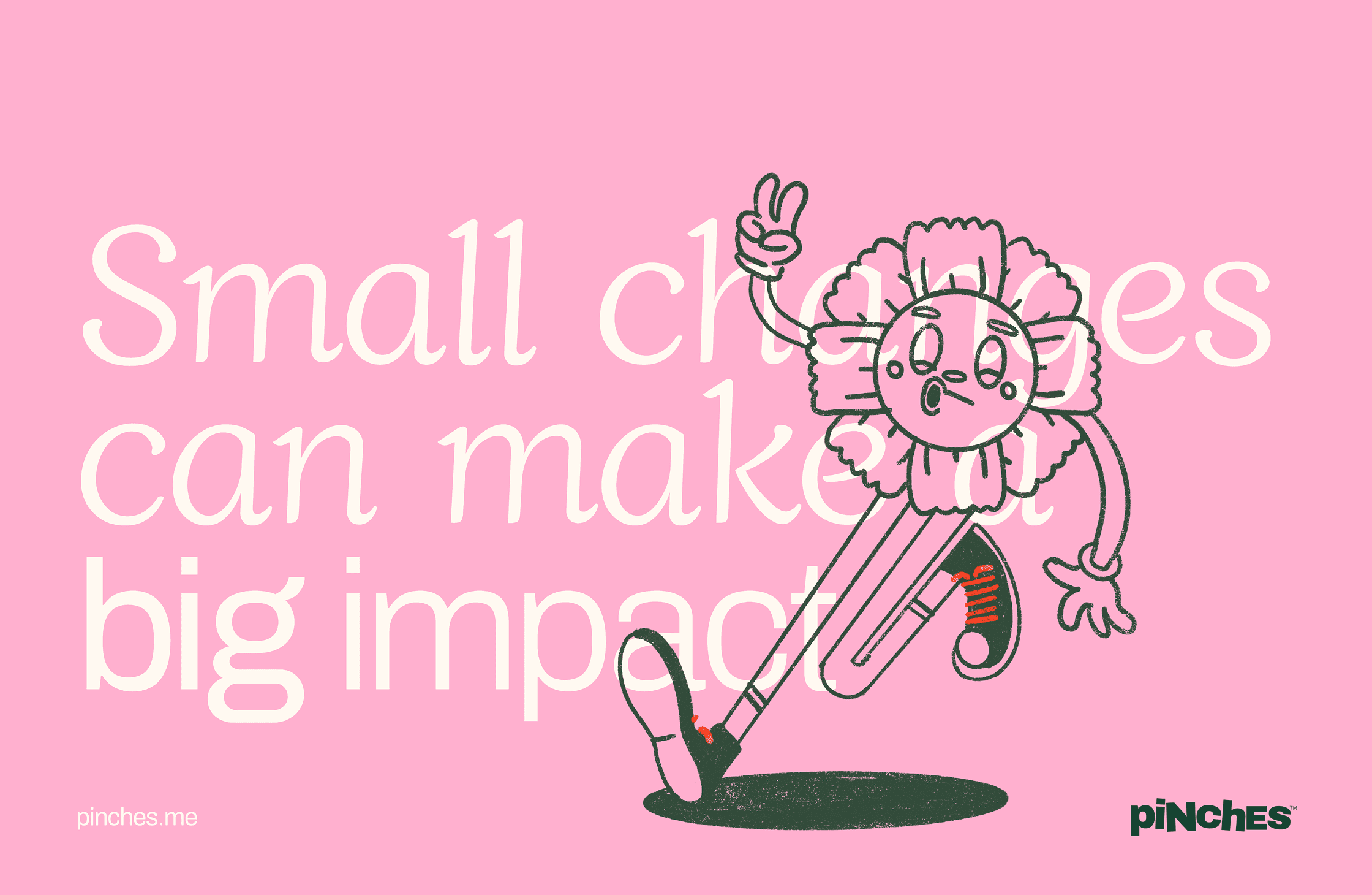
Pinches wanted to bring more cohesion to their brand, making sure their socials, website and activations were all dancing to the same beat. With a product line that serves a broad demographic—ranging from children and the elderly to runners, athletes and the disabled community—our team needed to develop a look and feel that would spotlight their laid-back, accessible vibe while turning heads. We wanted the energy, attitude and community-first focus that defines Pinches to shine through. This meant treating the project as more than a visual facelift, applying a structured process of discovery, concepting and delivery for a consistent “wow factor” at every stage.
The Solution
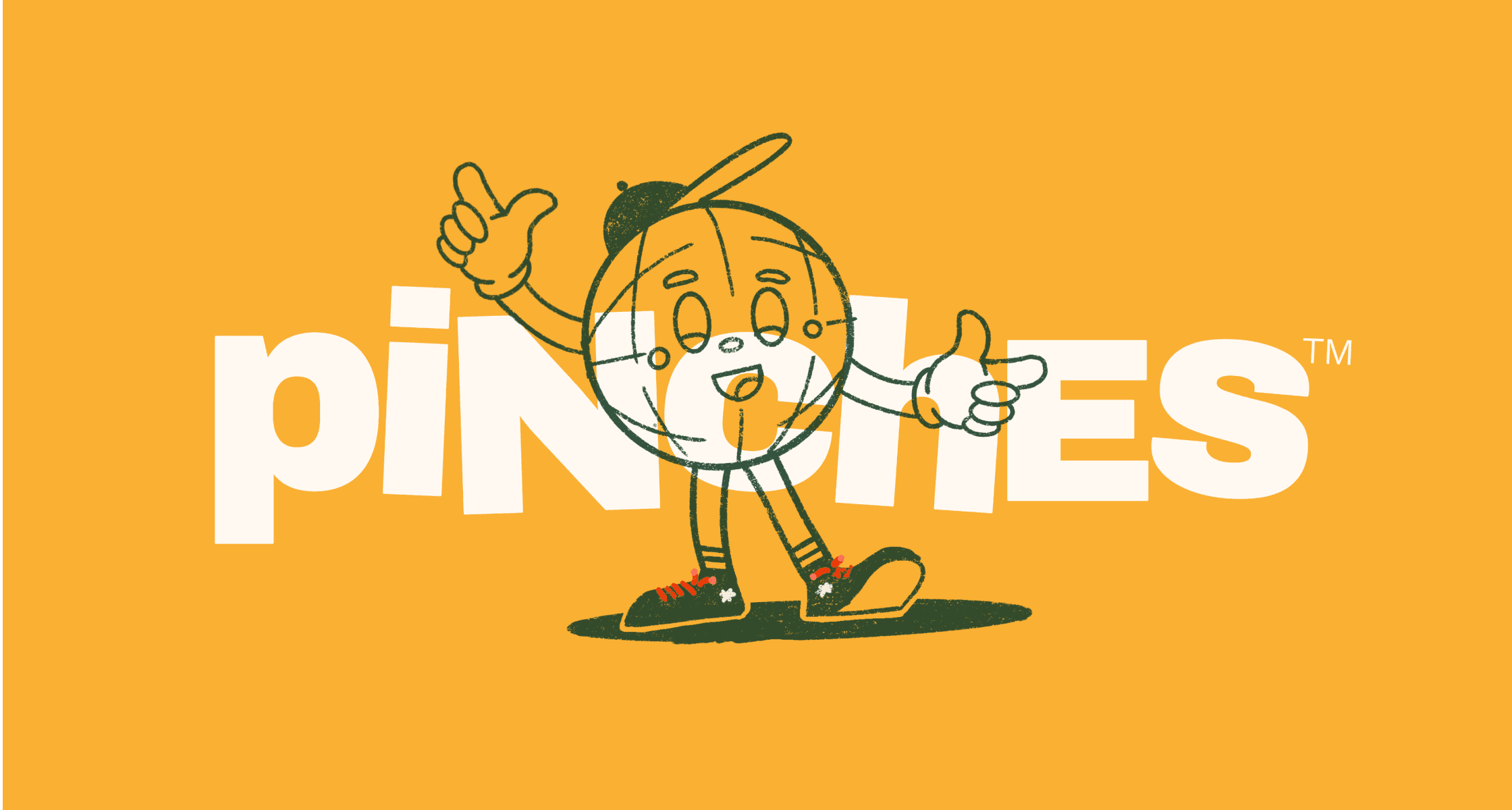
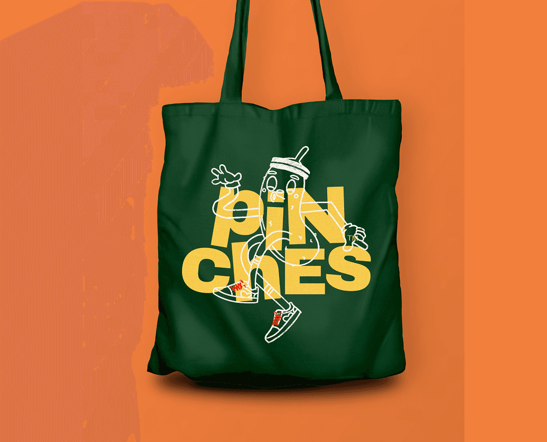
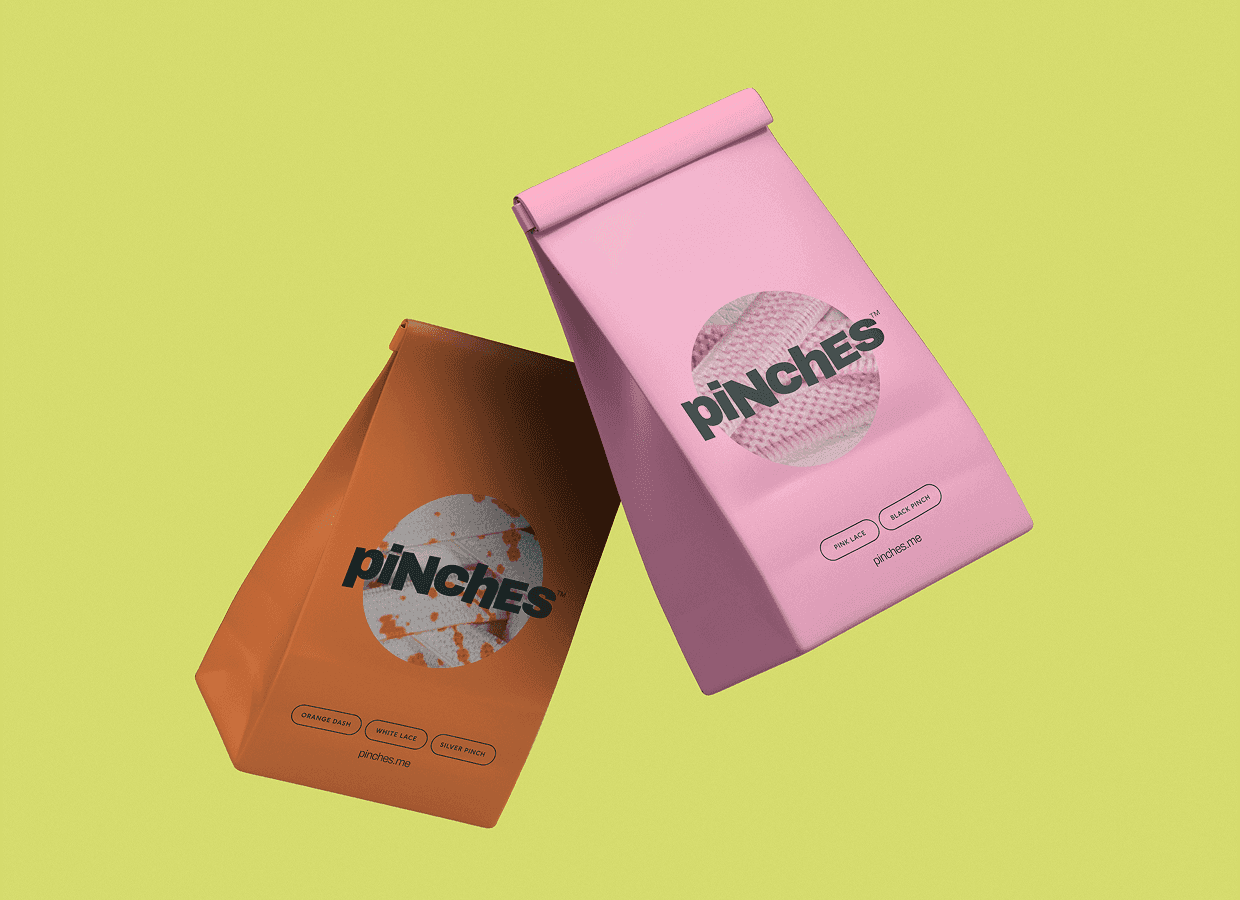
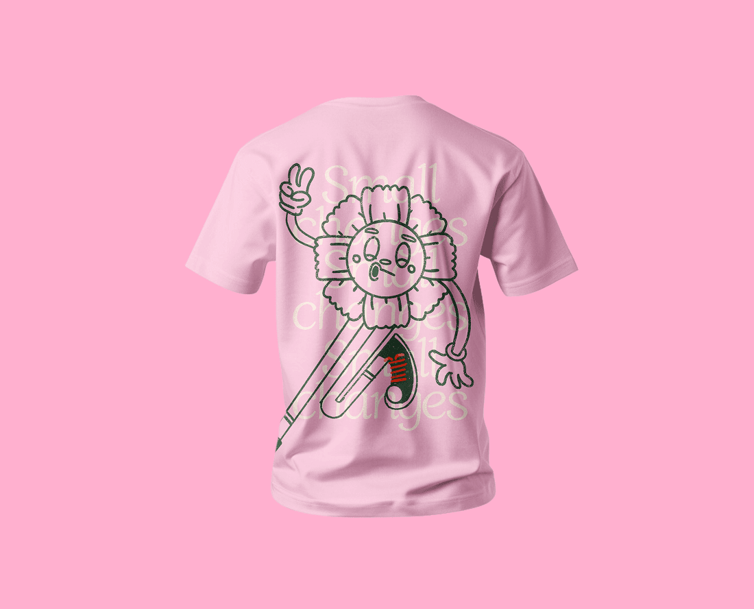
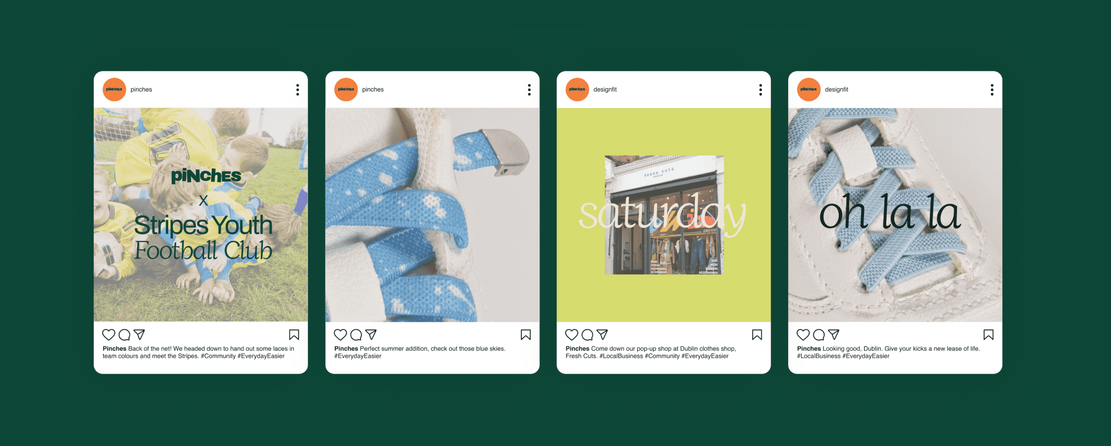
Our design team crafted an approachable visual identity for Pinches, blending playful yet earthy tones with a textured, handmade vibe. Mixed-case lettering and illustration were incorporated as a nod to the company mission of serving people from all walks of life. Meanwhile, we re-energised their brand voice, developing a tone that’s warm, dynamic and direct. Their redefined DNA and identity opened up fresh opportunities for creative brand activations, such as gifting personalised laces to the local football team. The system was built with this kind of flexibility in mind, designed to adapt seamlessly across packaging, the website, events and community initiatives as the brand continues to grow, and just as importantly, we equipped Pinches with the practical tools, guidelines and visual foundations they needed to carry the brand forward with confidence.
The Results
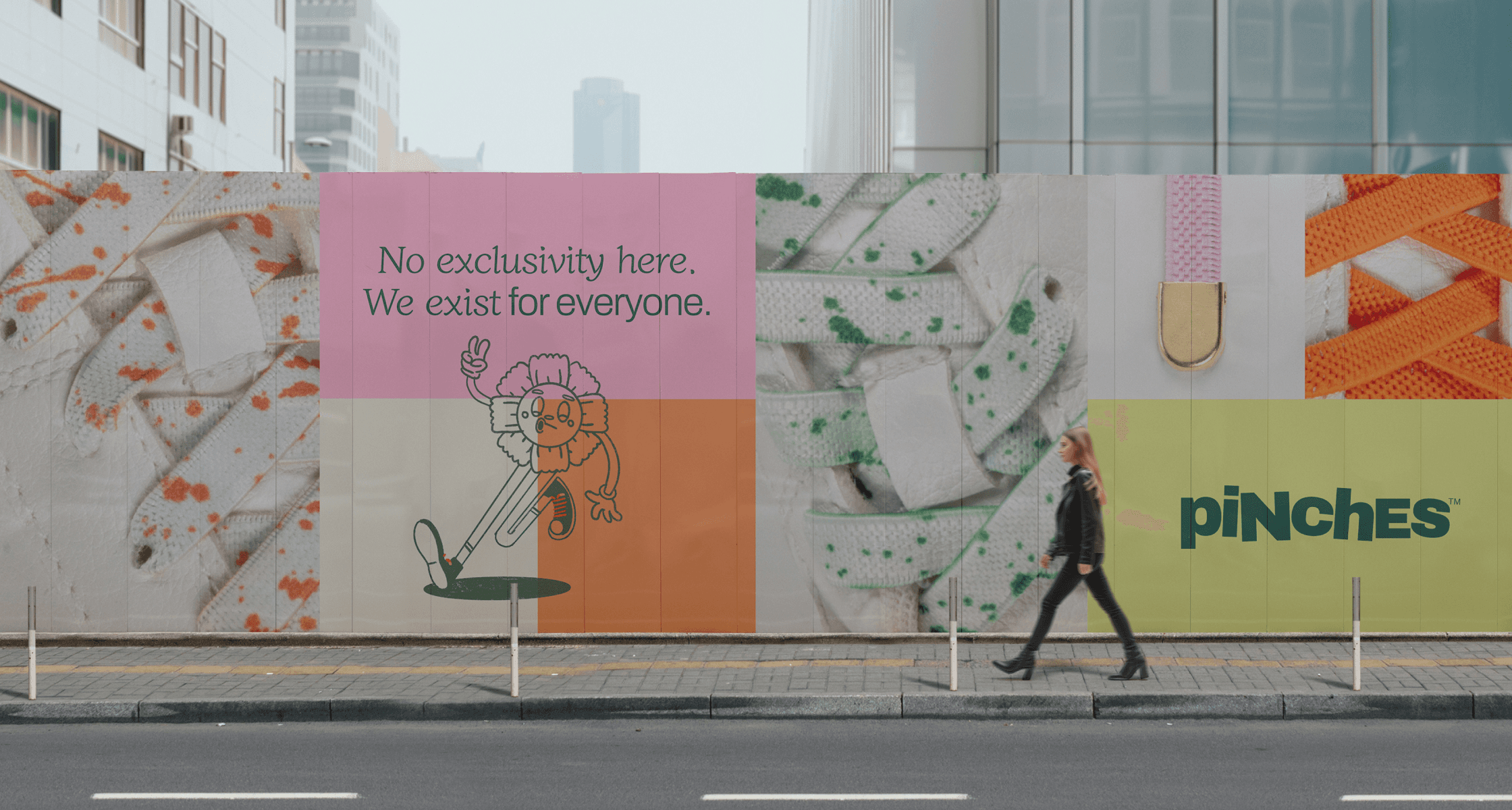
Pinches' brand transformation fuelled a surge in sales and stronger community connections, supported by a series of impactful local activations.
By combining brand strategy and identity with social media and community initiatives, Pinches repositioned its business to capture attention, connect with its target audience and establish a stronger presence in the lifestyle space.
For us at Studio East, the project demonstrated how a clear strategy and distinctive identity can help SMEs turn their personality and purpose into a professional, market-ready brand built to grow. We'd love to help bring that same clarity to your business. Let's talk.