Broode
Giving BROODE a Brand Parents Could Trust
Helping BROODE Redefine Parenthood Support
BROODE came to Studio East with a clear ambition: to reshape pregnancy and early parenthood support through a midwife-led continuous care platform. The vision was strong, but the brand needed a clear identity and a voice suited to the space. We worked closely with the team to build the brand from the ground up, developing the name, positioning, visual identity and tone into a dynamic and cohesive system designed for launch and long-term growth.
THE CHALLENGE
Through pregnancy and early parenting, support is often fractured, leaving parents caught between overly clinical, sterile medical apps and hyper-soft, sentimental lifestyle platforms. We saw a distinct opportunity to carve out a new category for BROODE. Instead of viewing this landscape as a limitation, we recognised the potential for a trusted ecosystem that combines the brand’s unique digital, in-person, and community elements. The goal was to establish a deeply trustworthy, non-clinical feel to set the stage for BROODE as the "modern village,” one that offers inclusive support for both parents, from the early stages of pregnancy right up to toddlerhood.

THE SOLUTION
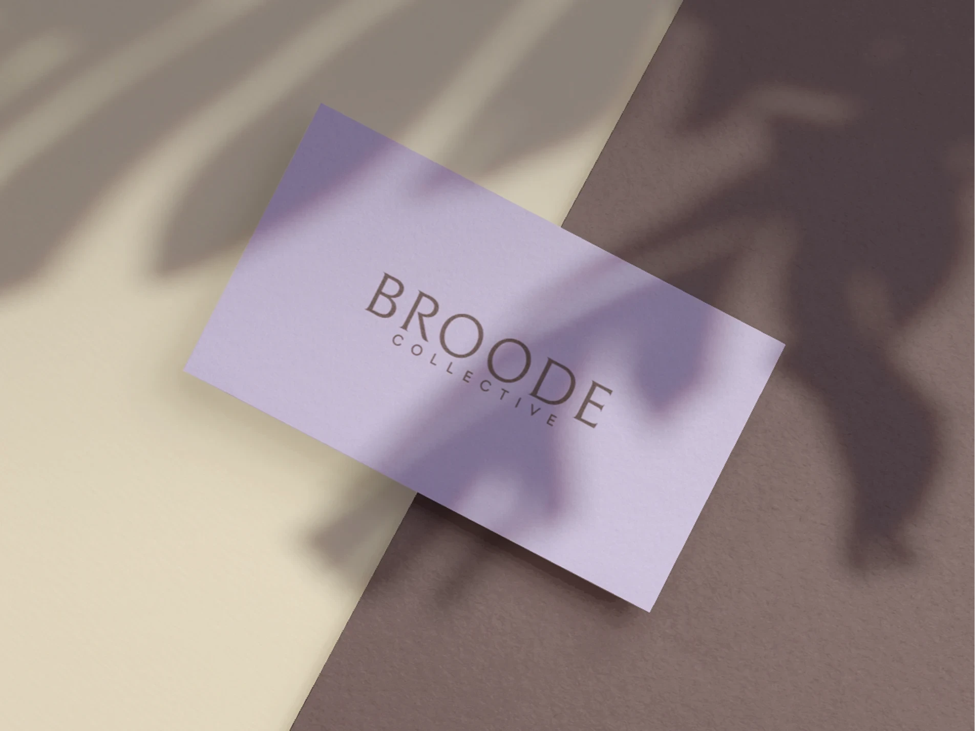
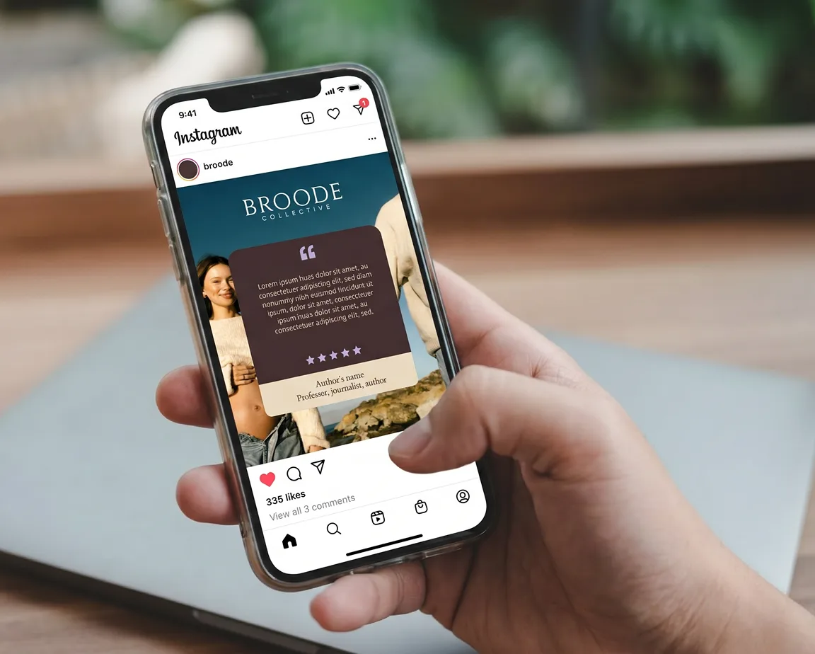
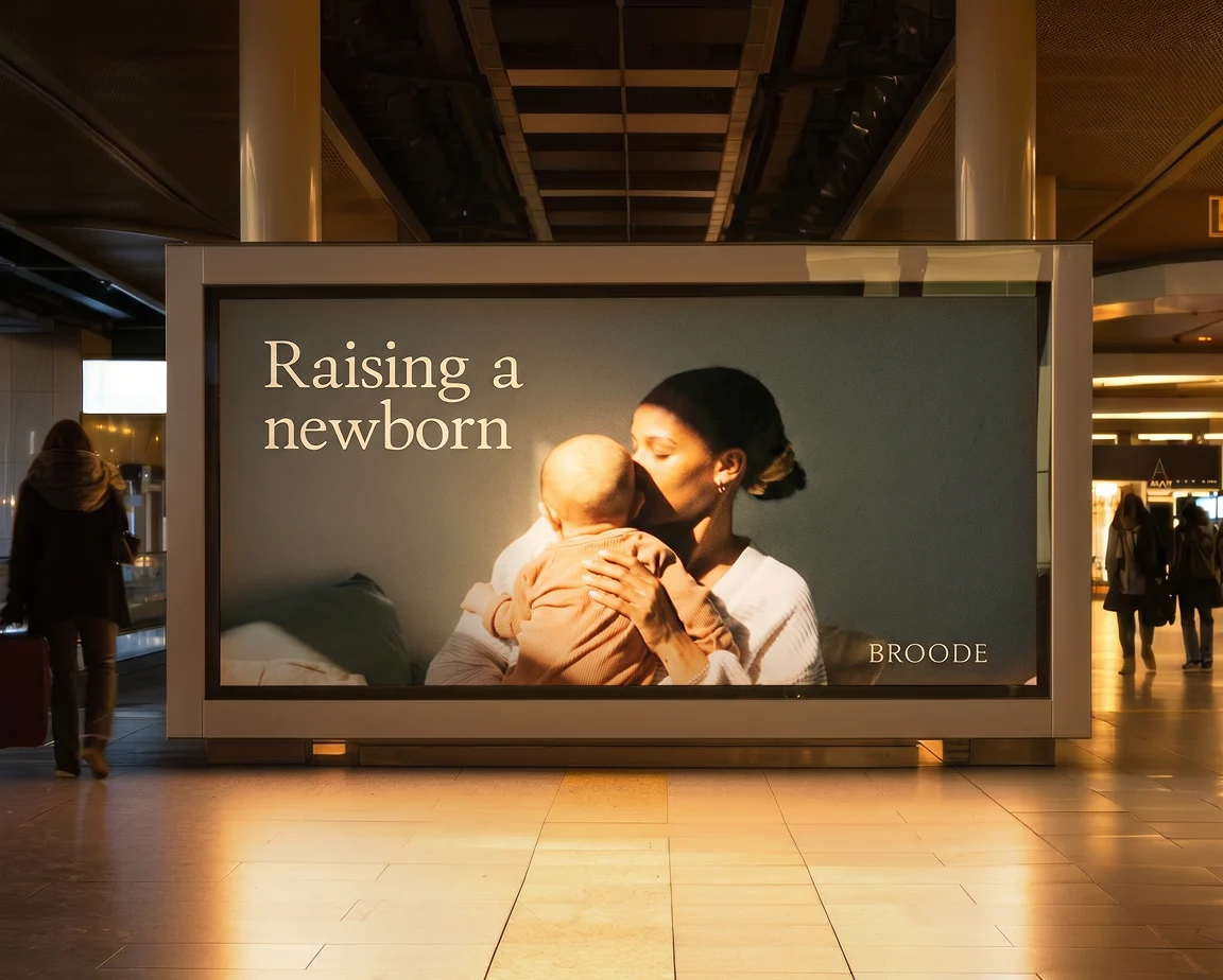
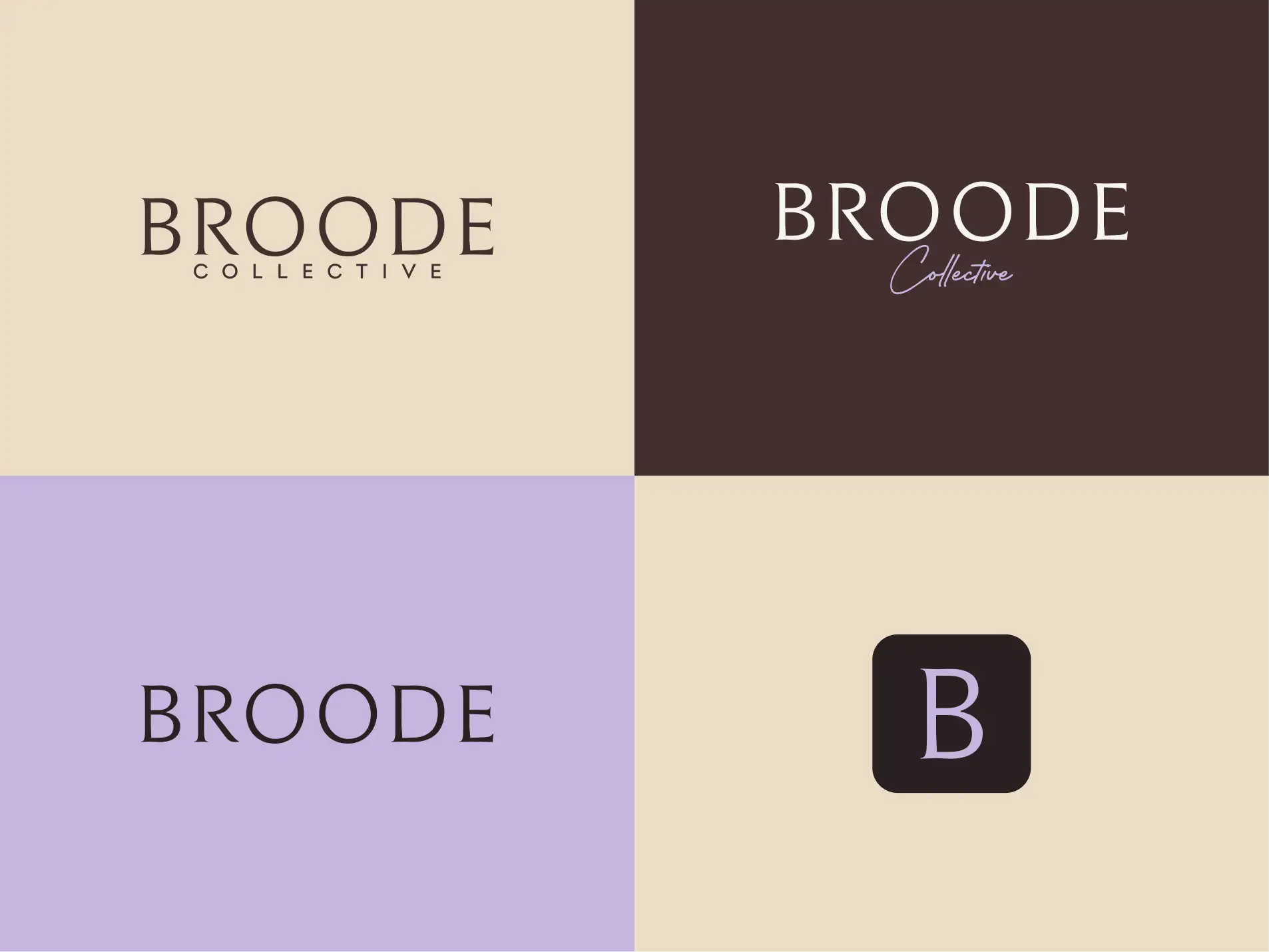
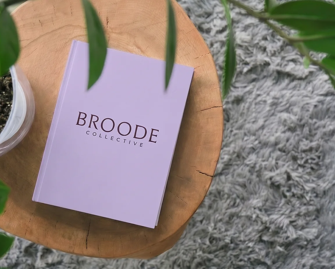
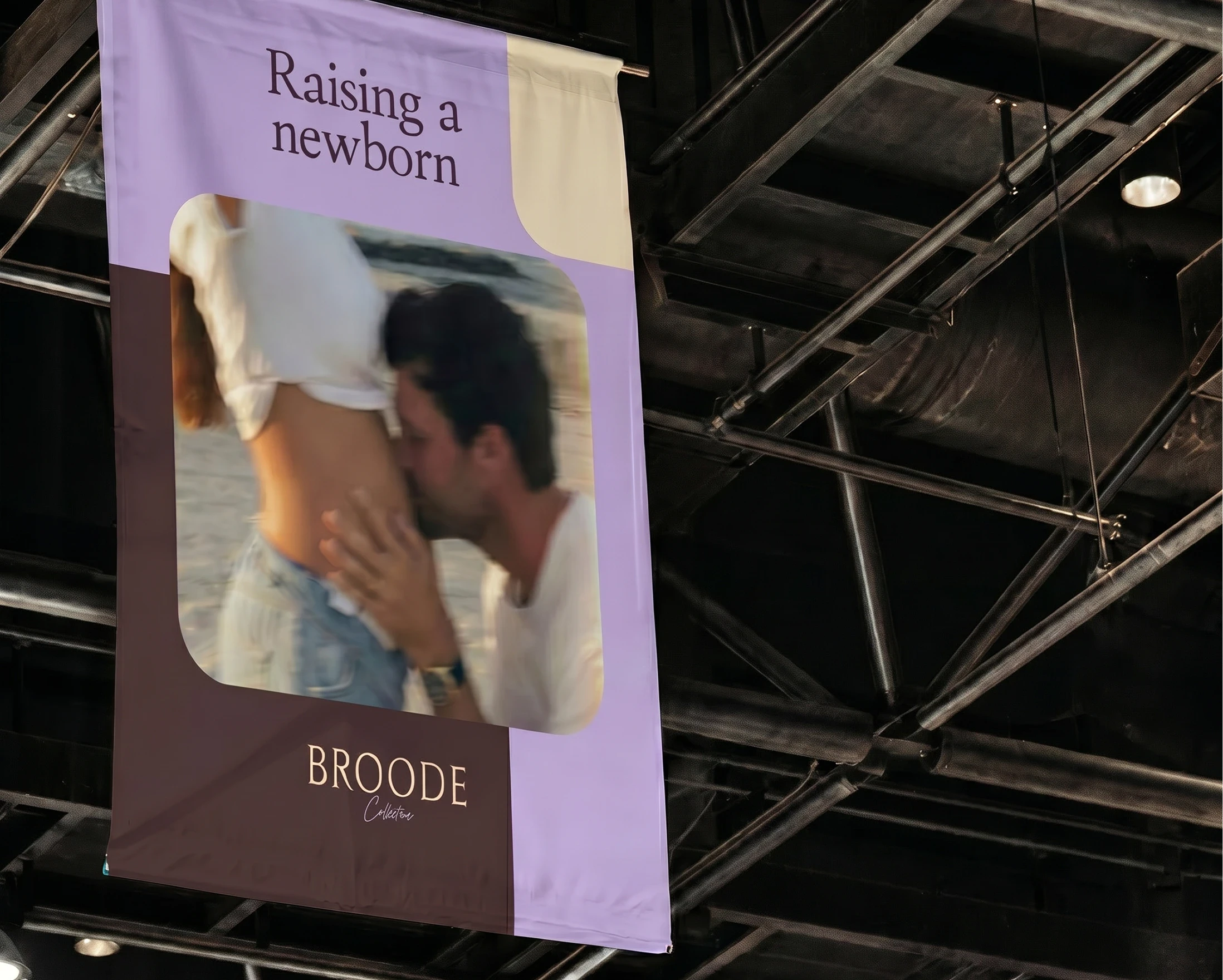
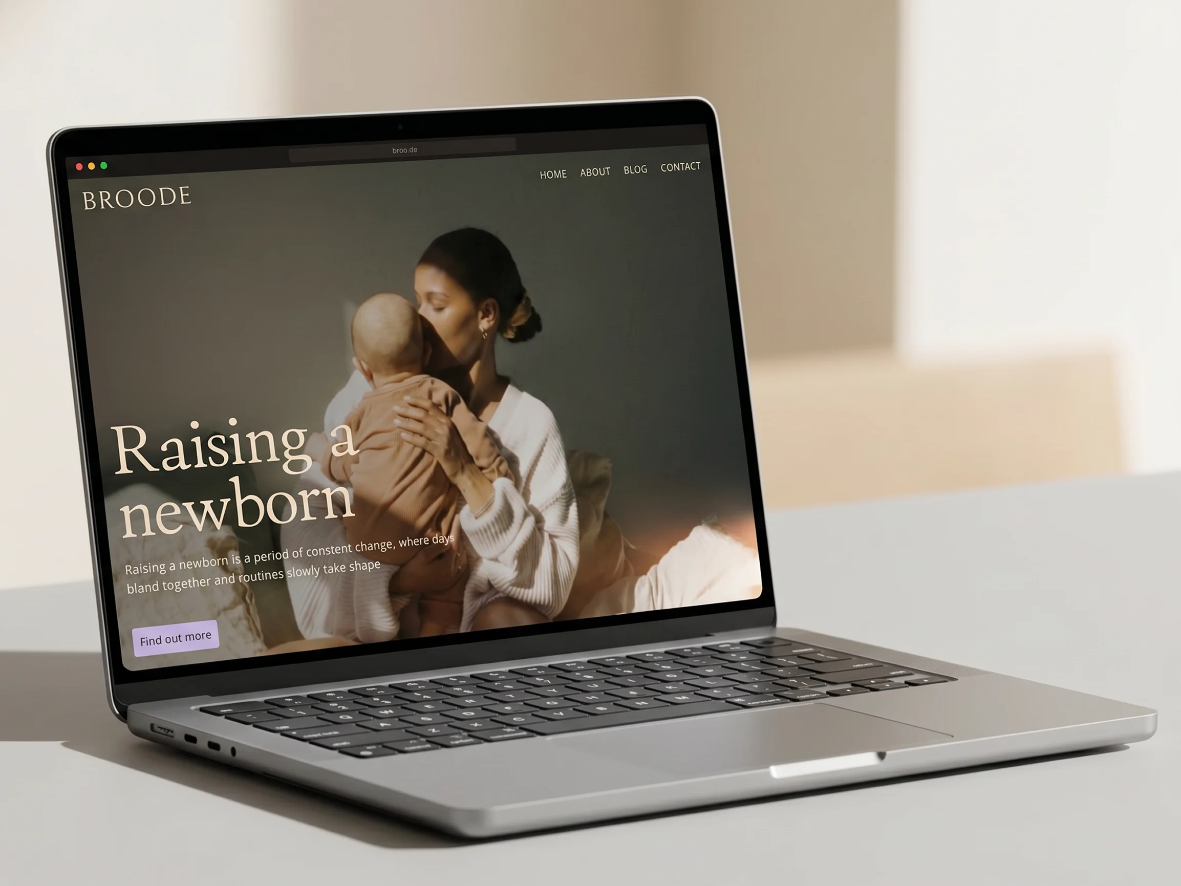
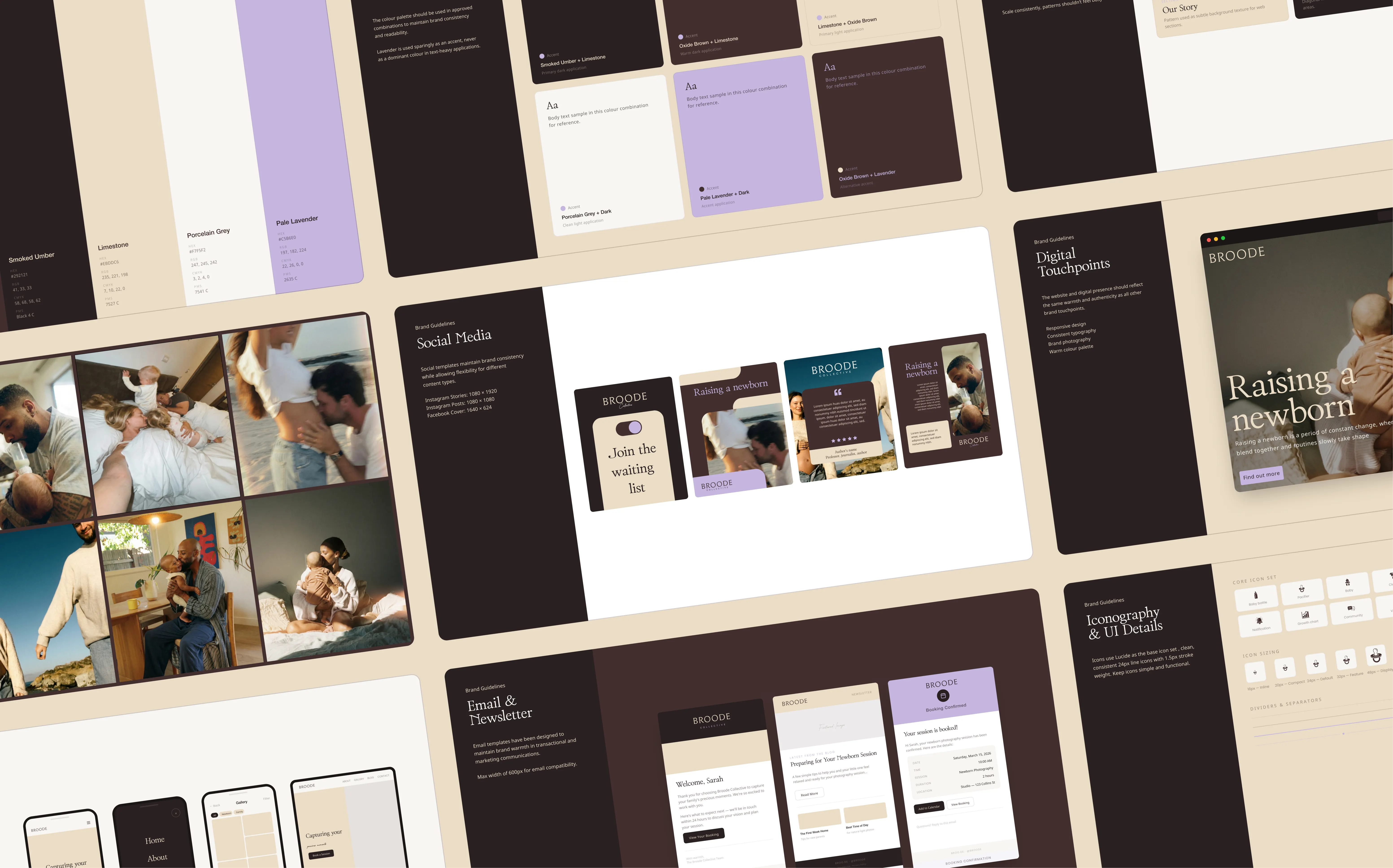
Our strategic journey began with defining a name that carried inherent narrative depth. BROODE emerged as the clear leader. Drawn from the word’s original meaning: to watch over and protect, we softened the aesthetic with the added “e,” while opting to lock it in all caps for a highly ownable graphic feel. With the foundational strategy anchored by the concept of a new type of modern village, we engineered a comprehensive brand DNA and content system, establishing three core pillars to guide social and platform messaging, and ensure every touchpoint felt supportive and expert-led in nature. Visually, we balanced premium design cues with a contemporary yet approachable community-focused aesthetic. Moving away from traditional industry tropes, we selected a palette and typographic layout for a sophisticated yet warm and welcoming feel. Finally, we translated the identity into a suite of launch-ready assets, web copy that articulates both the brand and the platform's value, and email and social media templates that empower the team to communicate with the consistency required to build trust with their audience.
THE RESULTS
Our collaboration equipped BROODE with a distinct position in the market ahead of its public debut. By transforming a brand with an expert-led business model into a visually striking and intuitive experience, we were able to deliver a visual identity and a strategic launchpad built for growth.
Armed with a rigorous brand narrative, a scalable verbal identity system, and a premium visual asset ecosystem—all anchored by an ownable name—the team is now perfectly positioned to scale their community of like-minded parents and fundamentally redefine the landscape of parenthood support.