What Makes a Great Logo Design (and Why It Matters)
Creating a logo design that sticks is no easy feat.
Scroll Down ↓
Some brands strip things back to minimalism, while others lean into bold, expressive visuals. As branding continues to move beyond the logo itself, there’s more room to experiment with colour, typography, imagery and other visual elements. But style alone doesn’t guarantee impact. If your logo design costs are rising but you’re not seeing results, it’s a sign something isn’t working.
We’re visual creatures, which means first impressions matter. With just 0.1 seconds to form one, your logo can either pull people in or push them away. That kind of snap judgement carries weight most brands can’t afford to ignore.
The challenge is designing a logo that balances instant recognition with lasting value. And while there’s no one-size-fits-all formula, certain design principles consistently lead to logos that build memorability and supports brand growth.
A great logo is only one part of a strong identity. The right brand and strategy gives it something meaningful to represent, connecting how your business looks with what it stands for and where it wants to go.
Let’s get into it.
The design principles that give logos lasting impact
1. Simplicity is your superpower
Our brains process simple shapes faster, and the data proves it. That’s why the strongest logos are often the easiest to remember.
Still, simplicity can trip up growing companies. In the effort to appear polished and professional, many default to pared-back marks. Think Nike’s swoosh: simple and instantly recognisable. But Nike is already known.
For newer brands, leaning too heavily on simplicity can lead to something generic. If your logo could belong to any company, it isn’t distinctive enough to stand out. Yet, studies find that over 60% of companies opt for non-descriptive logos, often out of fear that being too simple might look unsophisticated.
But clarity matters, especially for smaller business. A descriptive logo gives people context about who you are and what you do, and it can still be simple. Burger King nails this concept by showcasing what they sell in its logo. It’s descriptive and simple, which makes it one of the most recognisable marks in the world.
So, if you’re looking to scale with a memorable logo design, keep it simple and descriptive. Show your audience who you are in under a second. You can always refine later, but early on clarity builds trust.

2. Monochrome matters most
It’s easy to get carried away with colour, but a strong logo design shouldn’t rely on it. If colour does all the work, the design itself isn’t pulling its weight.
That’s why one of the core graphic design principles is to start in black and white. Starting in monochrome forces you to focus on form, spacing and contrast. These are the fundamentals that make a logo memorable.
If a logo holds its form in monochrome, colour only amplifies it. The world’s most recognisable marks, like Apple stand out because of their shape and structure, not their palette.
And this goes beyond aesthetics. In practical applications like packing, embossing, signage or invoices, colour isn’t always an option. Starting in black and white ensures your idea is clear in any format.
When the foundation of a logo is strong, colour become an enhancer, not a crutch. So, build the idea first, then let colour bring it to life.
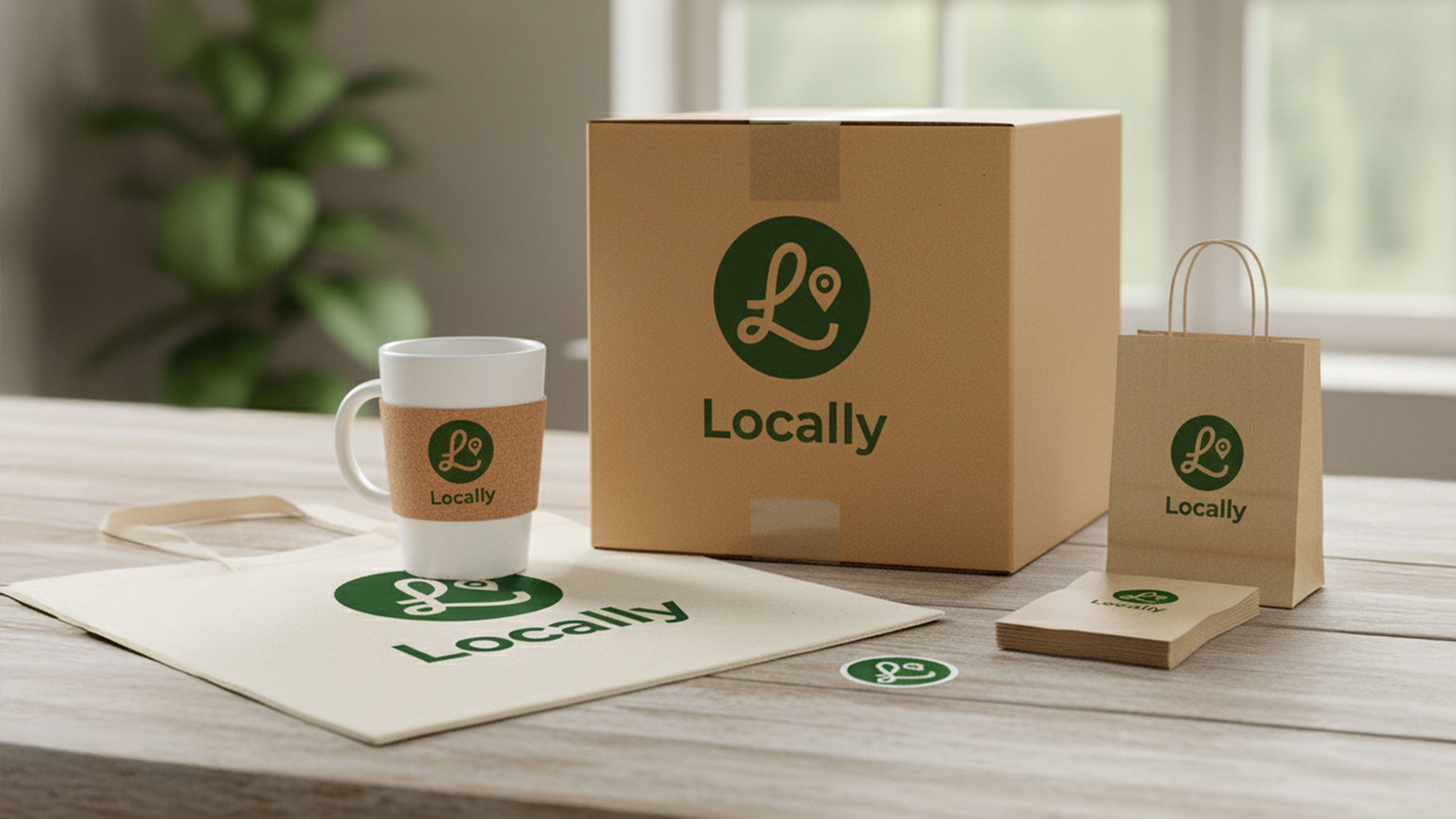
3. If it doesn't scale, it fails
As your brand grows, your logo needs to grow with it. From billboards to mobile screens, scalability is one of the most important aspects of professional logo design. If your logo isn’t flexible, it risks limiting visibility, losing clarity at smaller sizes or appearing blurry and pixelated.
That’s why simplicity matters. Simple logos stay clear at any size, while more complex designs risk being distorted when reduced.
Think of how the McDonald’s golden arches stay recognisable from a street sign to an online menu. That’s scalability in action.
With over 63% of people accessing content via mobile devices, small-screen performance is essential for your brand. Across your wider digital presence, web design and SEO need to work together to make sure your brand is not only visually recognisable but easy to find and engage with.
To futureproof your logo:
Use vector file formats (like SVG or EPS) to maintain a sharp resolution
Test your logo at large and small scales, across formats
Create responsive versions such as stacked, simplified or icon-only to strengthen recognition across channels
Designing for scalability reduces rework, keeps logo design costs low and helps your brand stay sharp.
4. Relevance without the cliché
Your logo should express your brand’s character and values but turning that identity into a mark isn’t always straightforward. It also needs to feel like part of a consistent brand identity, with the same visual character carrying through everything your audience sees.
Start with your audience. Who are they, and what visual cue will resonate with them? Choose typography, shapes and colours that feel relevant to your sector without slipping into cliché. Chasing trends may feel current today, but they fade fast and can leave your logo looking dated.
The goal here is balance. It should feel familiar enough to be relevant but distinctive enough to stand out. To help get there, you can:
Review competitors to see what has already been done
Spot the gaps where your brand can stand apart
Test whether the design reflects how both your team and your audience see you
Tools like the brand identity prism can help here. It breaks identity into six facets: physique, personality, culture, relationship, reflection and self-image. Using this framework to guide your logo decisions keeps the typography, form and colour of your logo aligned with who you are and how you want to be perceived.
That same thinking should extend beyond how your brand looks. Humanising your brand through authentic communication and storytelling can help the personality and values behind your identity come through across different channels.
Strong logo design balances relevance with originality. Build popularity for the right reasons by staying true to your mission and values.
5. Trends fade, balance lasts
The logos that last are built on balance and proportion, not just passing styles.
Keep in mind:
Ensure type, shapes and symbols work in harmony, whether descriptive or abstract
Asymmetry works when it feels intentional
Balance visual weight so no element dominates
Use spacing and alignment to create balance, even with varied sizes
Get proportions right so your logo stays clear from billboards to app icons
Make it yours, using brand identity frameworks to reflect your values and culture, not just trends
Think of the Chanel double C. It's barely changed in decades, yet still feels modern. That's the power of balance: a logo that not only looks good, but supports your brand for years to come.
That doesn’t mean a logo should never change. Sometimes, evolving an existing identity is more effective than starting again, retaining the recognition a brand has built while giving it room to move forward.
6. Give it meaning beyond the mark
A strong logo does more than look good. It should reflect who you are, what you stand for and how you want to be recognised.
Think about the foundations first:
Culture: The values and behaviours that define you
Vision: Where you’re heading
Mission: Why you exist
Use the brand identity prism to connect every design choice back to your brand. Bring meaning into the design with symbolism and narrative cues so every element, from shape to type, reflects your identity.
The best logos transform a simple mark into something people connect with, becoming anchors for campaigns, partnerships and every touchpoint in a consistent brand system. That connection is strengthened by great brand storytelling, giving the visual identity a story and meaning people can recognise and remember.
When your logo carries meaning, it’s easier to embed into everything you do. Keep storytelling simple, avoid complicated symbols and test with customers to ensure the message lands. Done well, your logo becomes more than a mark, it becomes a lasting symbol of your brand.
7. Great logos start off the page
Strong logos take shape long before the first design file is opened. Research gives you the insight to avoid costly redesigns and create something that feels both unique and relevant. Even as AI changes how designers work, faster execution can’t replace the research, judgement and creative thinking behind a strong idea.
Focus your research on:
Audience: Learn who they are, what they respond to and the cultural cues that shape their preferences
Competitors: Spot overused styles and find the visual niches your brand can own
Brand identity: Use frameworks like the brand identity prism to define your values, tone and personality
Context: Plan for where your logo will live the most, from mobile app icons to global print campaigns
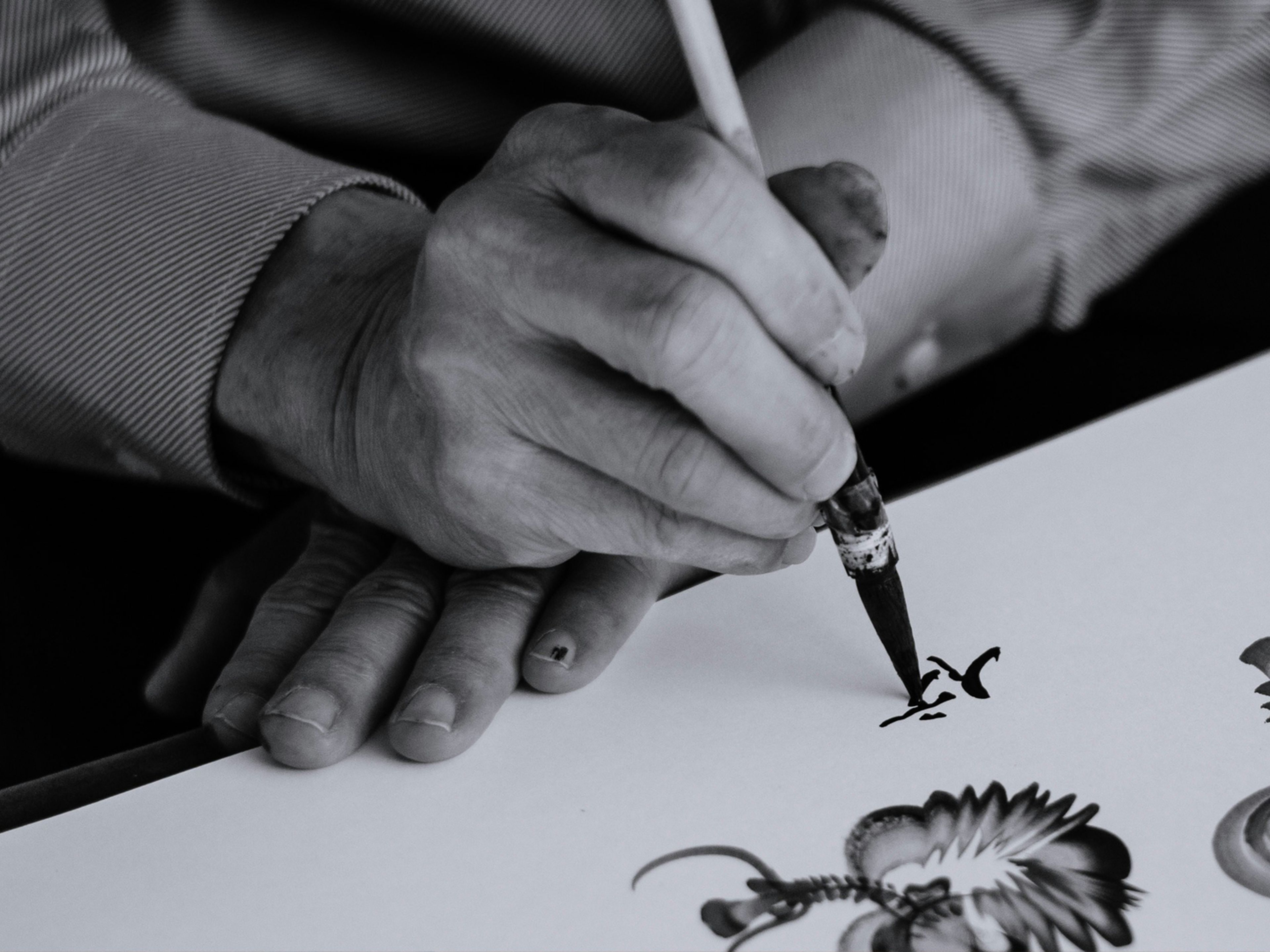
Once you have insights, put pencil to paper. Sketching lets you test ideas quickly, explore variations and spot gaps you might miss if you go straight into software.
8. Test it before you trust it
Personal preference can cloud judgment. What you like may not be what your audience remembers or responds to. That’s why testing your logo before launching is non-negotiable.
Here’s how to put your logo to the test:
Audience feedback: Test with a sample of your audience. Does it communicate your values and personality? Is it memorable? Try a recall test by asking them to sketch it from memory.
Internal teams: Does it reflect your brand identity and reinforce your story
Context testing: See how it works at different sizes, on different backgrounds and across digital and print.
Competitor check: Place it alongside other brands in your sector. Does it stand out while still feeling relevant?
Longevity check: Will it still work in five years or is it tied to a passing trend?
Refining at this stage saves costly redesigns later. A well-tested logo becomes a reliable brand asset you can use confidently across every channel.
Final takeaway: A logo that works as hard as your brand
A great logo design fosters recognition and builds trust, acting as a strategic anchor for your brand. But the reality is that creating one takes focus and expertise.
At Studio East, we give you the space to run your business while we craft a logo that makes your brand instantly recognisable and built to last.
Whether you’re building from the ground up or evolving your identity, we’ll design a visual system that connects with your audience and delivers long after launch.
Ready for a logo design that does more than look good? Speak to Studio East today.
FAQs
What makes a good logo design?
How much does professional logo design cost?
What are the key principles of logo design?
Should a logo follow current design trends?
When should a business redesign its logo?
Why is logo design important for brand identity?
Some brands strip things back to minimalism, while others lean into bold, expressive visuals. As branding continues to move beyond the logo itself, there’s more room to experiment with colour, typography, imagery and other visual elements. But style alone doesn’t guarantee impact. If your logo design costs are rising but you’re not seeing results, it’s a sign something isn’t working.
We’re visual creatures, which means first impressions matter. With just 0.1 seconds to form one, your logo can either pull people in or push them away. That kind of snap judgement carries weight most brands can’t afford to ignore.
The challenge is designing a logo that balances instant recognition with lasting value. And while there’s no one-size-fits-all formula, certain design principles consistently lead to logos that build memorability and supports brand growth.
A great logo is only one part of a strong identity. The right brand and strategy gives it something meaningful to represent, connecting how your business looks with what it stands for and where it wants to go.
Let’s get into it.
The design principles that give logos lasting impact
1. Simplicity is your superpower
Our brains process simple shapes faster, and the data proves it. That’s why the strongest logos are often the easiest to remember.
Still, simplicity can trip up growing companies. In the effort to appear polished and professional, many default to pared-back marks. Think Nike’s swoosh: simple and instantly recognisable. But Nike is already known.
For newer brands, leaning too heavily on simplicity can lead to something generic. If your logo could belong to any company, it isn’t distinctive enough to stand out. Yet, studies find that over 60% of companies opt for non-descriptive logos, often out of fear that being too simple might look unsophisticated.
But clarity matters, especially for smaller business. A descriptive logo gives people context about who you are and what you do, and it can still be simple. Burger King nails this concept by showcasing what they sell in its logo. It’s descriptive and simple, which makes it one of the most recognisable marks in the world.
So, if you’re looking to scale with a memorable logo design, keep it simple and descriptive. Show your audience who you are in under a second. You can always refine later, but early on clarity builds trust.
2. Monochrome matters most
It’s easy to get carried away with colour, but a strong logo design shouldn’t rely on it. If colour does all the work, the design itself isn’t pulling its weight.
That’s why one of the core graphic design principles is to start in black and white. Starting in monochrome forces you to focus on form, spacing and contrast. These are the fundamentals that make a logo memorable.
If a logo holds its form in monochrome, colour only amplifies it. The world’s most recognisable marks, like Apple stand out because of their shape and structure, not their palette.
And this goes beyond aesthetics. In practical applications like packing, embossing, signage or invoices, colour isn’t always an option. Starting in black and white ensures your idea is clear in any format.
When the foundation of a logo is strong, colour become an enhancer, not a crutch. So, build the idea first, then let colour bring it to life.
3. If it doesn't scale, it fails
As your brand grows, your logo needs to grow with it. From billboards to mobile screens, scalability is one of the most important aspects of professional logo design. If your logo isn’t flexible, it risks limiting visibility, losing clarity at smaller sizes or appearing blurry and pixelated.
That’s why simplicity matters. Simple logos stay clear at any size, while more complex designs risk being distorted when reduced.
Think of how the McDonald’s golden arches stay recognisable from a street sign to an online menu. That’s scalability in action.
With over 63% of people accessing content via mobile devices, small-screen performance is essential for your brand. Across your wider digital presence, web design and SEO need to work together to make sure your brand is not only visually recognisable but easy to find and engage with.
To futureproof your logo:
Use vector file formats (like SVG or EPS) to maintain a sharp resolution
Test your logo at large and small scales, across formats
Create responsive versions such as stacked, simplified or icon-only to strengthen recognition across channels
Designing for scalability reduces rework, keeps logo design costs low and helps your brand stay sharp.
4. Relevance without the cliché
Your logo should express your brand’s character and values but turning that identity into a mark isn’t always straightforward. It also needs to feel like part of a consistent brand identity, with the same visual character carrying through everything your audience sees.
Start with your audience. Who are they, and what visual cue will resonate with them? Choose typography, shapes and colours that feel relevant to your sector without slipping into cliché. Chasing trends may feel current today, but they fade fast and can leave your logo looking dated.
The goal here is balance. It should feel familiar enough to be relevant but distinctive enough to stand out. To help get there, you can:
Review competitors to see what has already been done
Spot the gaps where your brand can stand apart
Test whether the design reflects how both your team and your audience see you
Tools like the brand identity prism can help here. It breaks identity into six facets: physique, personality, culture, relationship, reflection and self-image. Using this framework to guide your logo decisions keeps the typography, form and colour of your logo aligned with who you are and how you want to be perceived.
That same thinking should extend beyond how your brand looks. Humanising your brand through authentic communication and storytelling can help the personality and values behind your identity come through across different channels.
Strong logo design balances relevance with originality. Build popularity for the right reasons by staying true to your mission and values.
5. Trends fade, balance lasts
The logos that last are built on balance and proportion, not just passing styles.
Keep in mind:
Ensure type, shapes and symbols work in harmony, whether descriptive or abstract
Asymmetry works when it feels intentional
Balance visual weight so no element dominates
Use spacing and alignment to create balance, even with varied sizes
Get proportions right so your logo stays clear from billboards to app icons
Make it yours, using brand identity frameworks to reflect your values and culture, not just trends
Think of the Chanel double C. It's barely changed in decades, yet still feels modern. That's the power of balance: a logo that not only looks good, but supports your brand for years to come.
That doesn’t mean a logo should never change. Sometimes, evolving an existing identity is more effective than starting again, retaining the recognition a brand has built while giving it room to move forward.
6. Give it meaning beyond the mark
A strong logo does more than look good. It should reflect who you are, what you stand for and how you want to be recognised.
Think about the foundations first:
Culture: The values and behaviours that define you
Vision: Where you’re heading
Mission: Why you exist
Use the brand identity prism to connect every design choice back to your brand. Bring meaning into the design with symbolism and narrative cues so every element, from shape to type, reflects your identity.
The best logos transform a simple mark into something people connect with, becoming anchors for campaigns, partnerships and every touchpoint in a consistent brand system. That connection is strengthened by great brand storytelling, giving the visual identity a story and meaning people can recognise and remember.
When your logo carries meaning, it’s easier to embed into everything you do. Keep storytelling simple, avoid complicated symbols and test with customers to ensure the message lands. Done well, your logo becomes more than a mark, it becomes a lasting symbol of your brand.
7. Great logos start off the page
Strong logos take shape long before the first design file is opened. Research gives you the insight to avoid costly redesigns and create something that feels both unique and relevant. Even as AI changes how designers work, faster execution can’t replace the research, judgement and creative thinking behind a strong idea.
Focus your research on:
Audience: Learn who they are, what they respond to and the cultural cues that shape their preferences
Competitors: Spot overused styles and find the visual niches your brand can own
Brand identity: Use frameworks like the brand identity prism to define your values, tone and personality
Context: Plan for where your logo will live the most, from mobile app icons to global print campaigns
Once you have insights, put pencil to paper. Sketching lets you test ideas quickly, explore variations and spot gaps you might miss if you go straight into software.
8. Test it before you trust it
Personal preference can cloud judgment. What you like may not be what your audience remembers or responds to. That’s why testing your logo before launching is non-negotiable.
Here’s how to put your logo to the test:
Audience feedback: Test with a sample of your audience. Does it communicate your values and personality? Is it memorable? Try a recall test by asking them to sketch it from memory.
Internal teams: Does it reflect your brand identity and reinforce your story
Context testing: See how it works at different sizes, on different backgrounds and across digital and print.
Competitor check: Place it alongside other brands in your sector. Does it stand out while still feeling relevant?
Longevity check: Will it still work in five years or is it tied to a passing trend?
Refining at this stage saves costly redesigns later. A well-tested logo becomes a reliable brand asset you can use confidently across every channel.
Final takeaway: A logo that works as hard as your brand
A great logo design fosters recognition and builds trust, acting as a strategic anchor for your brand. But the reality is that creating one takes focus and expertise.
At Studio East, we give you the space to run your business while we craft a logo that makes your brand instantly recognisable and built to last.
Whether you’re building from the ground up or evolving your identity, we’ll design a visual system that connects with your audience and delivers long after launch.
Ready for a logo design that does more than look good? Speak to Studio East today.
FAQs
What makes a good logo design?
How much does professional logo design cost?
What are the key principles of logo design?
Should a logo follow current design trends?
When should a business redesign its logo?
Why is logo design important for brand identity?